As I've gone through the day today, I've collected a list of articles and videos for you. When you have a few moments, dig in.
Let's start with, potentially, the biggest story of the day. It's not the largest headline but it's a development that may have lasting repercussions:
And here is the companion piece to that:
Next, the latest from JS Kim at SmartKnowledgeU
Our pal, Jim Quinn, has written another, very interesting article. Here is Part I:
https://www.theburningplatform.com/?p=32217
and here is Part II:
https://www.theburningplatform.com/?p=32480
And so has Jeff Nielson:
Lastly, this video I found of Jim Grant. Shot in Washington DC last week, Jim takes about an hour to discuss and dissect the Federal Reserve. It's definitely worth your time to watch. WARNING: Jim is a brilliant, but somewhat dry, speaker. Do not watch while driving or operating heavy machinery as the following video is certain to produce drowsiness.
And that's all for now. TF
9:55 am EDT UPDATE:
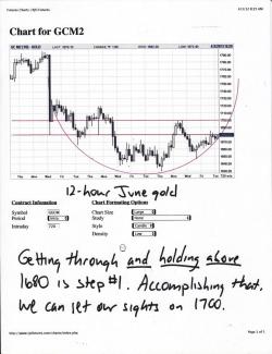
Just thought I might tag some updated charts onto this post and then start a new one later today, after the Comex close. On the charts below, you can clearly see the significance of 1680 in gold and 33 in silver. Now you know why those levels are being defended by The Forces of Darkness. Expect this to continue. It is my hope, however, that Comex buying will emerge again today, particularly after the London afternoon fix. Yesterday saw similar action so I'm hopeful that we'll see it again today.This would kick gold above 1680 again and silver would follow, up through 33. We need to consolidate those gains there and then begin to move away. Silver's next target would be 33.50-33.75 and gold would look to move on 1700. Lastly, note that the "smiles" I've been drawing on the 12-hour charts have just about used up their usefulness. Though I still fervently believe that the metals are forming rounded bottoms for this "correction", it appears unlikely that they will rebound as quickly as they sold off. But, since when is that news? It's always "the elevator down but the stairs up".
One last chart today...the S&P. The daily charts I print from the RJO site only show about 4 months worth of data so I've been waiting for this day as I knew the chart would only show price from the late November low until today. It's, frankly, astonishing. When have you ever seen a chart of anything that simply muddles along at a constant pace higher over four months? That this chart is of the S&P, the most-watched stock index in the world, makes it all the more ludicrous. Can anyone please tell me what, fundamentally, has occurred over the past four months to drive this index UP 25%, and in such a linear manner? Anyone? Anyone??? Nope, the perfectly-angled ascent (particularly the Jan-Feb timeframe where the index rose for 29 out of 41 days) is clear evidence of Fed interference and manipulation, all part of the increasingly desperate, ongoing campaign of MOPE and SPIN.
More later today. TF


