


The 34 year long term bond cycle resists government attempts to manipulate it, because it is the government interference cycle!
The Dow, the index which is around for so long that we consider it almost irrelevant nowadays. We look towards the wider based averages to pull in a greater number of stocks, in the hope that a 2000 stock average will be more relevant and less manipulated due to the greater number of issues that comprise it.
But do not write the DJIA off so fast. This venerable old lady of averages has a value that is actually enhanced by its age. The DJIA in its former glory as the Dow Jones 30 has been through the mill so to speak, it has seen world wars, and booms, and busts, and depressions. It shows us how the economy reacts under presidents who sat for a second or even third term, and I firmly believe that these individuals do things differently than one term presidents, especially later in their careers.
So to get started with the graphics let us have a quick look:
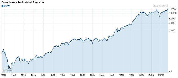
Yes! That’s the one we all know so well. The 1929 crash is visible over there on the left, then after it the depression trading range, with 2 world wars, and then the meteoric rise up into the 1960s then the 1970s recession with the oil booms, and the gold crash and rise, and after stagflation it rose again through the 1990s to the top in 2000, and we are crawling through life within the depression towards the right hand side.
OK, now that is firmly refreshed in your mind, please take a look at this chart of the Dow over at Macrotrends: https://www.macrotrends.net/1319/dow-jones-100-year-historical-chart
It's a great chart and thanks to Macrotrends for making it interactive and publicly available so that I can link to it.
This has a different look to it. The 2000s high is there, and the 1929 high is there, but there is another high in the middle, at 1966. This is the inflation adjusted Dow, which is the DJIA divided by the CPI index for each date. We can now see the growth of the 1960s in all its glory, when the baby boomers were born amid plenty, or relatively good amounts of it compared to other periods in the 20th century.
The inflation adjusted Dow is very interesting because it has a similar cyclical structure as eg bond yields. Bonds also have an approximate 30 year cycle you see. So if we look at the inflation adjusted Dow, it becomes relatively simple to look back and find a period that from the point of view of interest rates and their direction of trend, is similar to today.
So now that you have seen that chart I will move your attention back to the unadjusted or nominal Dow, but I will place a cycle on my chart to reflect the bond market and interest rate scene upon the unadjusted DJIA. We see that this is the inflation adjusted Dow to a large degree. Here it is:

I appreciate that on this chart you can hardly see the highs and lows in the 1930s and 1960s, but that cycle reflects them reasonably well for the purposes of this discussion article. It also happens to reflect the underlying momentum of the annual Dow figures, so an RSI of eg a monthly chart should have a momentum high in the 1965 area too if anyone wants to try it.
We need to zoom in a little on the last decade maybe to see more.

There is the last wave with the 30+ year cycle added. it is set with it's high more in accordance with the stocks than the bonds, so on a bond chart the high might be earlier or later, but it's about the same length.
Now at this stage I’d like to draw something about the actual turning form or shape to your attention:

The new highs which the Dow has made, since 2000, are not present in the inflation adjusted Dow. Long term holders of DJIA component stocks during the past 13 years have made no capital appreciation, except for dividend income received.
We also are aware of the nagging long term cycle which is pointed downwards at the moment.
Let’s consider that cycle for a moment. In particular I would like to highlight certain dates and the intervals between then:

The lows here are lined up with the inflation adjusted lows, and seem to be timed about when the stagflation periods come to an end. The absolute price low in the Dow usually seems to arrive during the decline period, which is prior to the low dates shown here.
So this is interesting. It shows that the government and Fed print, and pump, and they even change the way that the CPI is calculated to make inflation appear lower than it really is, .... and still the Dow fails to make new highs, and still the 17 year cycle moves slowly and without deviation towards it’s conclusion. Well their predecessors were doing the same stuff in earlier waves of this cycle, this cycle is their actions to a large degree. They are in it - not controlling it.
There is for example an interesting article about second term presidents and their economic performance here: https://www.economist.com/blogs/graphicdetail/2013/01/daily-chart-14
So it seems that every 34 years approximately bonds make a high, there’s a recession or depression, and the stock market goes down to sideways while the government stagflated and financially represses with negative interest rates. This stagflation prevents growth until they wake up and stop doing it. But a closer inspection of these periods shows that there are usually 3 or 4 sub waves within the long wave. The lesser waves within the big wave seem to represent the effects of the various government entities as they thrash about within the economy.
I suggest that we will still get these minor swings within the big one, but without any requirement to get specific which would lengthen this article rather a lot - in the broad sense - the charts provided here suggest that the big one still has a few years to go yet.
Argentus Maximus
.
This is not investment advice. It is personal opinion only. It is put out there by the author for discussion purposes and to invite critique, to stimulate debate, entertain, and ideally create a lively beginning for a reasoning process among readers who interact with each other and may lead towards a better financial understanding of the times we live in. People wishing to trade financial markets should get professional advice, and be aware that it is relatively easy to lose more than you invest in financial markets.
The author posts daily commentary on the gold and silver markets in the TFMR forum: The Setup For The Big Trade. More information about the author can be found here: RhythmNPrice.


